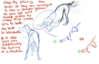
What makes Milt Khal’s art so good?

 Milt Kahl is probably one of the most studied and beloved artists in animation. He has often been pointed to as the greatest draftsman of his generation. I am in no exception of also being in complete awe of his drawing, I first became aware of him for the skill he showed in drawing hands, however this skill really extended to every facet of his work. 

The Disney style really refined and evolved from Milt’s pencil in the years he was active at the studio. Many artist would turn to him to help refine there character designs and have him help out with particularly difficult drawings. In a studio full of masters of their craft he stood out way above the rest. But what made his work so good and so much better than the rest. 

When I first started looking more seriously into the Disney artist and particularly Milt’s work while I could clearly see his skill in areas such as the hands and just generally all his work looked flawless however I didn’t necessarily see why he was so much better than some of the other artist at the studio or some of the other Nine old men.

As I studied more and probably as I was becoming a stronger artist I could start to see how he would draw and design characters with far more thought and consideration for just good looking designs than the others. It could be the most subtle things that would make his work sing, when another artist would draw a shape it might feel soft and undefined when Milt worked over the same drawing (something he was constantly asked to do) he could push and refine that shape in the most perfect way.

 It can be hard to quantify or specifically point to what he’s doing better but it’s there in everything he draws! The man couldn’t make a bad drawing! 

Shiyoon Kim a phenomenal artist in his own right, shared a segment of a lecture he gave where he did just that, breaking down what Milt Kahl is doing that some of the other artist just weren’t. This I think perfectly captures the subtle differences Milt could inject into his work that was why he was considered the best.


This breakdown has become a bit of a North Star for me in terms of inspiration of how I look at others art and the world when I try to draw and design. I don’t think I’m any where near this level of observation skills but I strongly believe this is the blueprint to get me there. All the credit in the world goes to Shiyoon Kim for this breakdown, even to be able to observe and make this informative analysis shows what a high level he is working at, which is evident in his own design work.

Comments

Popular posts from this blog

Liliana’s quest style test

 So I have been working on this personal project for a while called Liliana’s Quest, a adventure game with a visual style reminiscent of dragons lair and classic Disney movies. I have been chipping away at this project doing character designs and teaching myself how to animate and learn how to paint backgrounds in the style I want. I’m thinking I might create a specific dev blog for this project so I can share all my progress with stuff like character designs etc. but for now I wanted to share an update while it’s fresh in my head. I recently just finished the biggest bit of animation I’ve ever done. I’m still pretty novice at animating and wanted to take a shot to a relatively finished product to see if I can even achieve the style I have in my head, this would be helpful as I want the game to have lots of high quality cutscenes. I made a lot of mistakes in the animation that I didn’t pick up on until I was too far in the process, I decided to power through and finish the shot just so

Lilo and Stitch Deleted scene

 Here’s a beautiful pencil animated scene that was cut from Lilo and Stitch. It’s rather crazy to me that a scene as powerful and important as this, that has been taken this far through production then got cut. The themes are very moving and it’s quite a statement in itself to decide to not include it. Someone had to watch this scene, understand the message and then say “nah let’s not go there”   I’m not sure who the animators were on this, Andreas Deja was main animator for Lilo so that’s not a bad guess, that he might of been involved. I suspect it was multiple animators, as it’s really multiple shots / characters that could be handled by different people. Anyway the animation is superb…

Glen Keane draws Ariel and Pocahontas

Glen Keane is probably the most influential artist in my life, I could watch him draw forever. I had grown up with his work for many years without knowing who he was but my first major discovery of him as an artist was when I first saw his expression sheets for Rapunzel in the movie Tangled. From then on I think Glen became an artist I always had in the back on my mind. Expression sheets have always interested me since then, something about how they make a drawn character feel alive instead of just lines on a paper. It wasn’t until a few years later when I was feeling unsure about my artistic career, I was actually experiencing my first significant success, landing a good artist job but instead of being happy I and was overall feeling very uncertain about if this was what I wanted to do for the rest of my life, I’d spent so long grinding to get good enough I hadn’t taken a moment to go up for air and make sure I was swimming in the right direction.  It was during this time I decided to